Layer by Layer: The Making of Gems
How do you create a painting that feels bigger than it is? For me, the answer begins with color—and with patience.
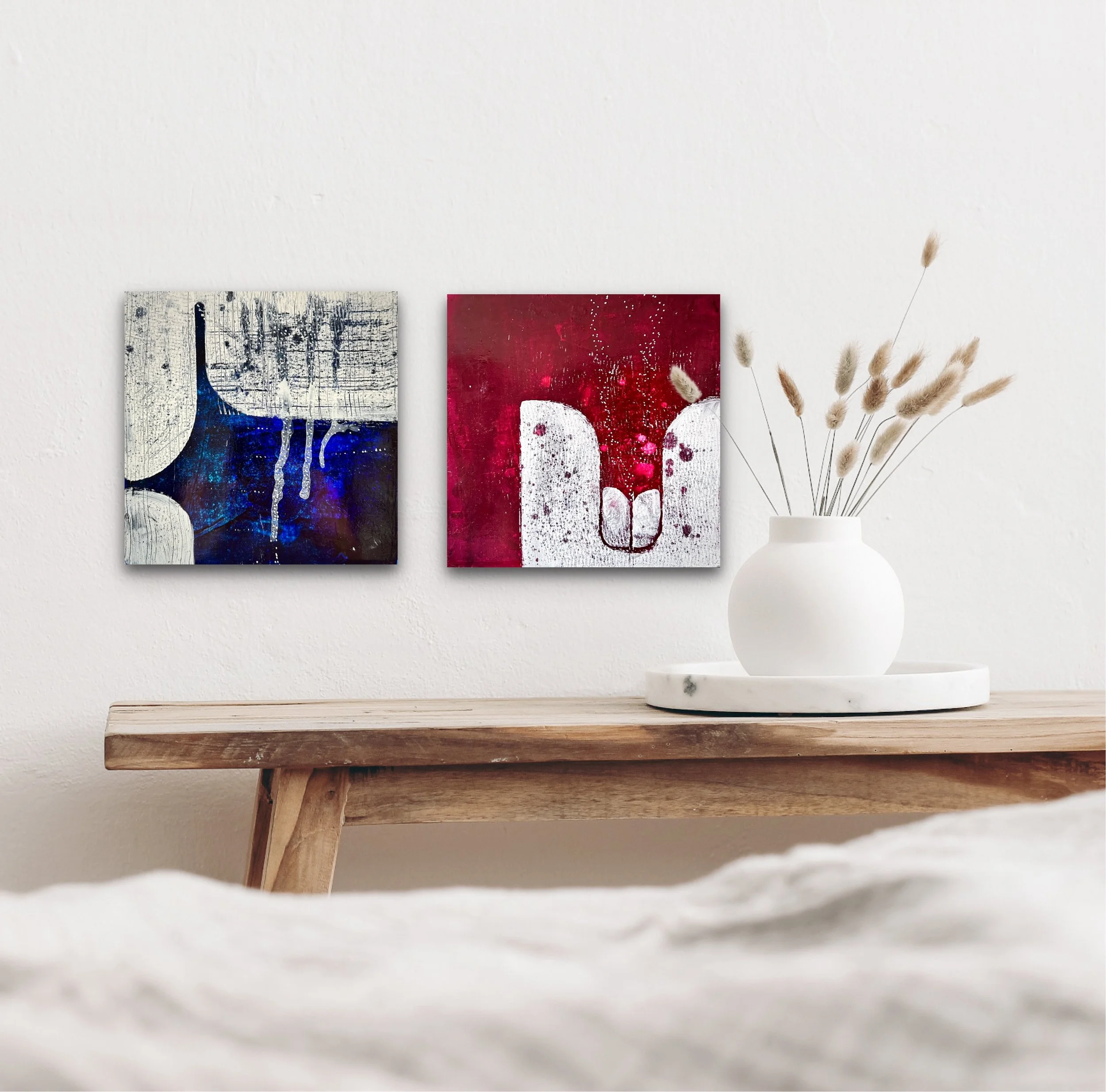
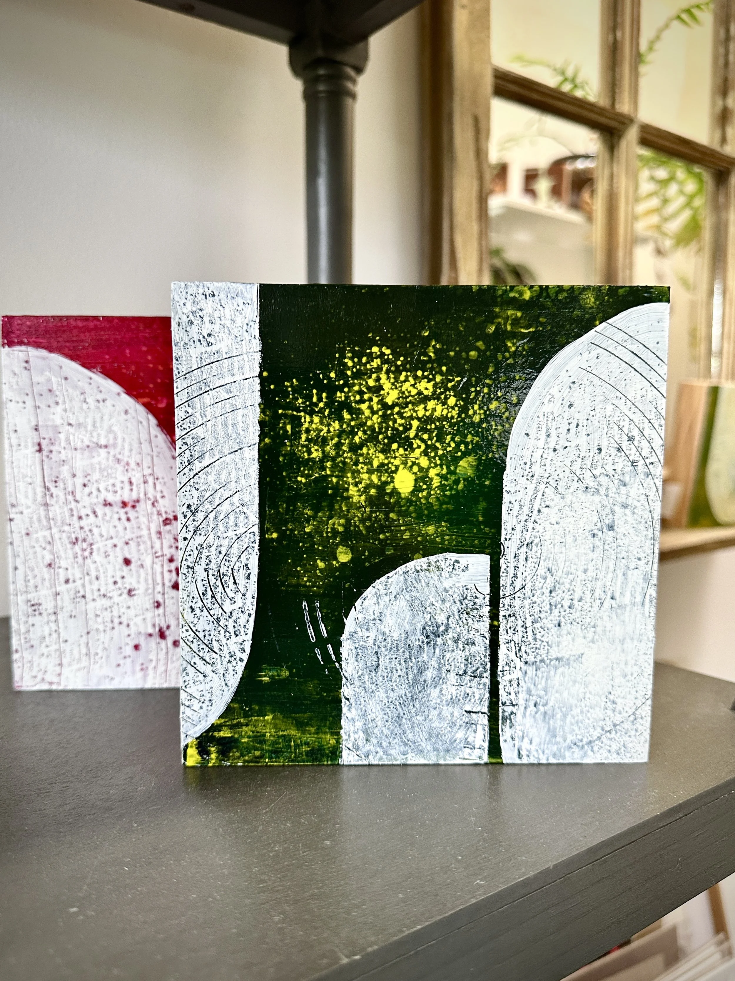
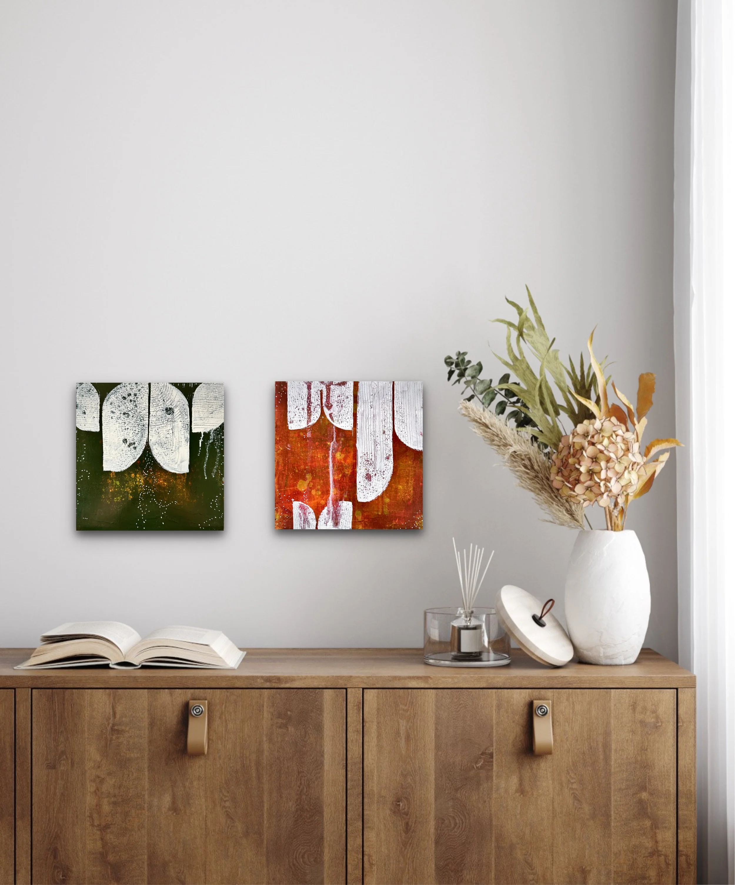
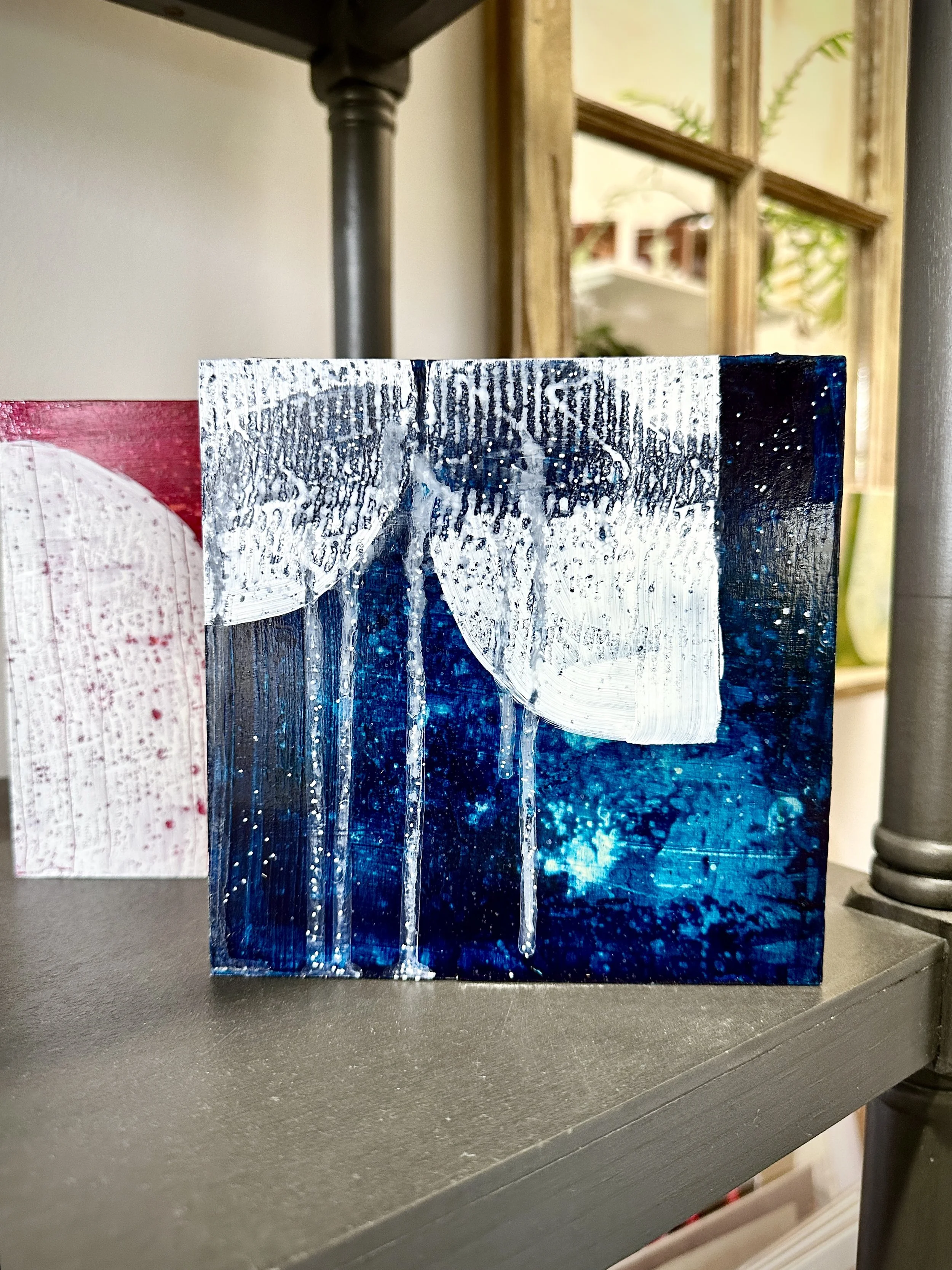
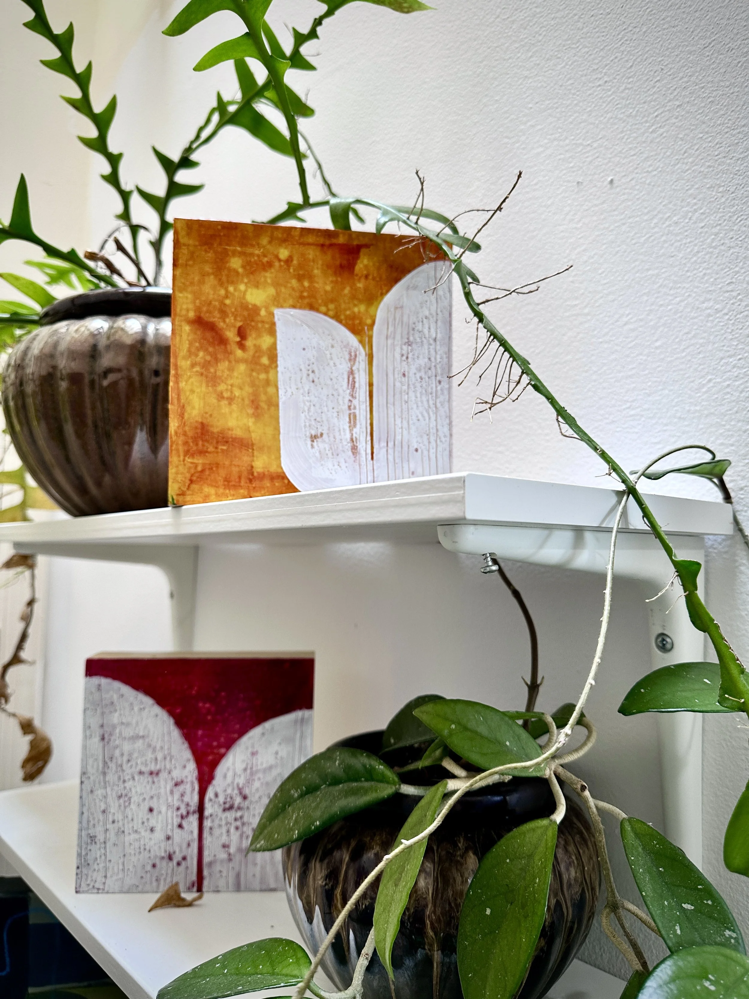
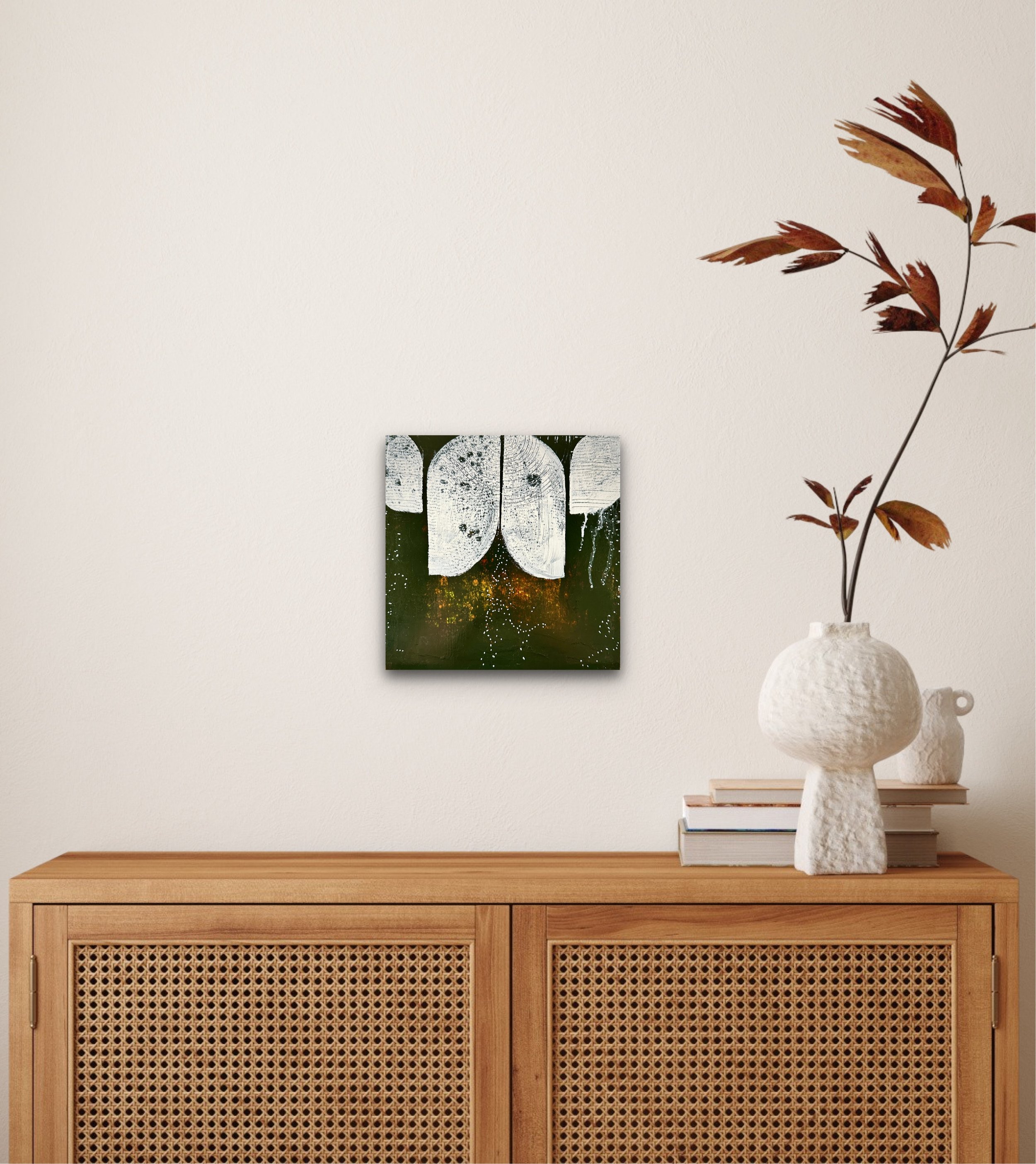
The paintings in my new collection, Gems, are small in scale, but loud in spirit. Rich, saturated colors glow from their surfaces, shifting subtly as you move closer. Some feel jewel-like; others bring to mind the vivid colors of flowers, forests, minerals, and other elements of the natural world. The paintings are intentionally intimate, inviting you to come close and spend a little time with them.
The secret to their intensity is layering.
Rather than applying one thick layer of color and calling it finished, I build these paintings gradually with many thin, transparent glazes. Each layer allows the color beneath it to remain visible, while subtly changing what we see on the surface. A warm glaze might deepen the color underneath. A cooler one can shift its character entirely. As the layers accumulate, the color becomes deeper, richer, and more complex.
Between each pigmented layer, I apply a clear layer which serves to let light pass through the layers and increase the sense the depth within the colors.
There is something almost magical about this process. The final color isn't simply sitting on the surface—it feels as though it has gathered there over time.
The beauty of building slowly
Working with transparent glazes requires patience. I have to allow each layer to dry before deciding what comes next, and I often make many adjustments along the way. The painting develops through a conversation between what I've already done and what I think it needs next.
This way of working has a strong connection to my admiration for artist Anne Truitt, whose used a process of layering thin washes of color over her sculptures. Truitt's surfaces can appear deceptively simple at first glance, but the depth color reveals itself as you interact with the work.
That idea has become an important part of my own process (both in Gems and in my other paintings). I want the paintings to reward looking closely—to reveal something new as your eye moves across the surface and notices the subtle shifts between layers.
Bold color in a tiny package
Making Gems small allowed me to focus intensely on this process. With less physical space to work with, every decision becomes concentrated. A few inches of surface can hold an astonishing amount of color, texture, and visual energy.
The result is a collection of paintings that I think of almost like their namesake: small, vivid, and precious.
The titles come from colorful elements in nature — Woodland, Hibiscus, Lapis —reflecting the connection I continually find between color and the natural world. These paintings are for those of us drawn to the power of color in nature: the electric color of a flower, the deep green of a forest, the unexpected intensity of a mineral or stone.
That feeling is what I hope these paintings bring into a home.
A Gem doesn't need a large wall or room to make an impression. It can live on a small wall, a bookshelf, a bedside table, or tucked into a corner where you encounter it every day. Its scale makes it approachable, but the accumulated layers of color give it a presence that invites you to look closer.
Small paintings. Deep color. A little piece of beauty to keep.
That is the spirit of Gems.